When a door is usually open, you see parts of two rooms at once. The wallpapers need to look good in that view as well as within their own rooms. They can be quite different designs, provided you can see a reason for them to belong together.
Start with the wallpaper you most want to use. It gives the second choice something specific to respond to.
A painted garden beside a softer painted wall
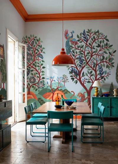
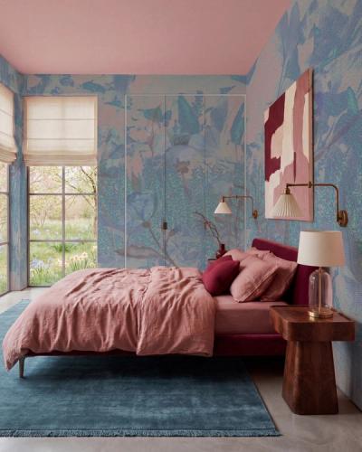
Colorful Garden I has loose flowers and several noticeable colors. Soft Abstract Beige is a gentler option for the room next door.
The link is in their painted character and warm pale areas. The garden carries the recognizable subject, while the abstract allows a change in the amount of detail. That can be useful when one room is intended to feel livelier and the other more restrained.
To connect the pair further, take one flower color into a small item in the second room. A cushion or piece of pottery can be enough. You do not need to repeat the garden's whole palette.
Two nature designs with different kinds of space
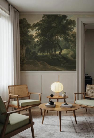
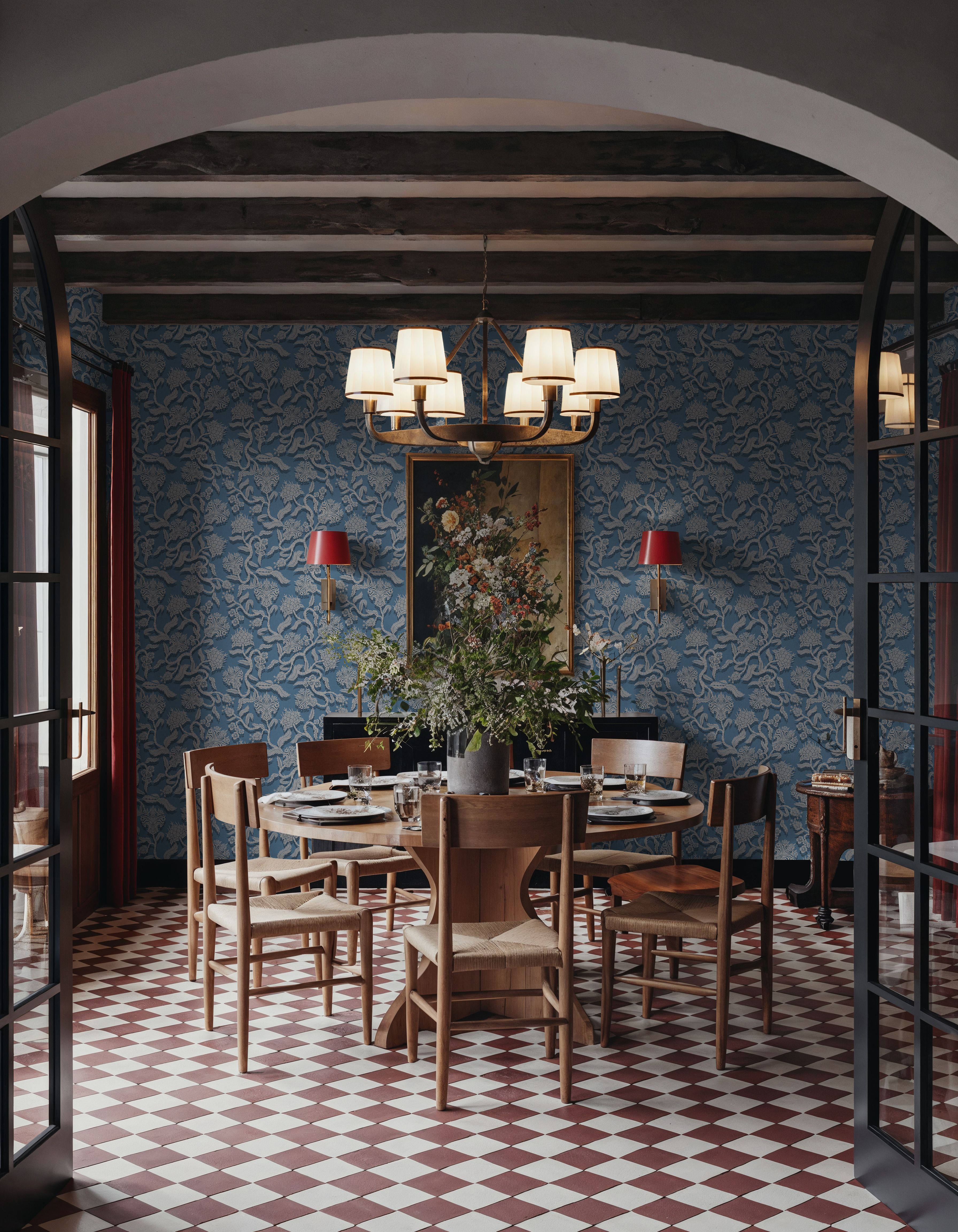
A forest and a flowering branch share a subject family, but their compositions differ. Historic Lands, Forest Green gives you a continuous landscape. Magnolia Season repeats branches across a blue background.
The pairing brings nature into both rooms, with a different composition in each. Brown stems and earthy details offer a connection between them. The change from landscape to repeat makes the doorway a clear transition.
Look at the background colors through the doorway before choosing paint for the door frame. A warm off-white could provide a consistent boundary around both, rather than trying to match the frame to one wallpaper and leaving the other without a link.