A cream wallpaper can look different in your room from the way it looked on your screen. In the Northern Hemisphere, north-facing windows often bring cooler, more indirect daylight. That light changes the balance of colors, particularly in pale designs.
You can choose a warmer palette or enjoy a deeper, more enclosed room. Start with the effect you want, then look at how much daylight the room actually receives. The direction of the window is one part of that picture.
If you want pale walls, compare the warm colors carefully
A pale background takes up a large part of the wall, so its color matters more than a small accent in the design. Look beyond a label such as white or beige. Does the background lean toward cream, pink, gray or yellow?
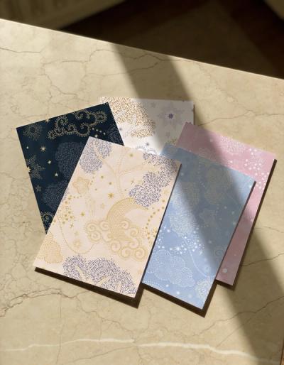
Soft Abstract Beige combines cream and sand tones with warmer painted areas. It offers a starting point if you want a light wall with more variation than a plain neutral.
Bring it into the comparison beside the room's existing whites. A cream wallpaper next to bright white trim may look warmer than you expected. That difference can be attractive, but choose it deliberately. Matching every pale surface closely is another option, especially if you want the wall and woodwork to feel continuous.
Warm flowers give you color without covering the whole wall
If you want warmth that is more visible, consider how it is distributed through the design. A few warm details against cream have a different effect from an orange background covering most of the wall.
Shirley Novak's Pumpkin Poppies I puts orange and yellow flowers on a cream ground. You get warm color in the blooms, with plenty of lighter space between them.
Look at the flowers beside the wood and fabrics you already own. With golden oak, the combination continues the warmth. With a gray sofa, the flowers introduce a clearer change. Choose the relationship you prefer rather than assuming a warm wallpaper will suit every north-facing room.